Note: I am not a professional developer. Use at your own risk and be ethical about data usage.
Picture this: your Head of Marketing has a CSV. She wants to know if any anomalies are in the data of last year. She is not a data scientist or analyst. Your calendar is already blocked. And the answer she needs is sitting right there in her file, completely inaccessible to her.
This is the gap I wanted to close. Not by hiring more analysts, not by buying another BI subscription — but by giving non-technical people a tool that translates raw data into actual insights, locally, privately, without a single line of code on their end. The bottleneck in most organizations isn’t data. It’s the distance between data and the person who needs to act on it.
Local Analyst is built for the manager who got handed a spreadsheet, the marketing practitioner running a campaign, the strategy consultant trying to make sense of a client’s export — anyone who has a bunch of data but needs insight.
The Idea: Analytics as a Vending Machine
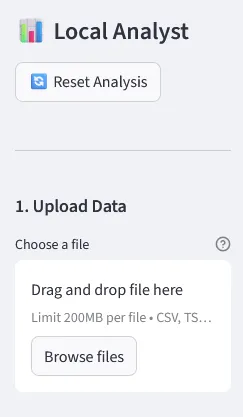
The core concept was almost embarrassingly simple: make statistical analysis as frictionless as possible for people who aren’t data scientists/analysts. No Python installs for the end-user, no API keys, no “just connect your account real quick.” You drop a file in, you get analysis out.
But here’s where it gets interesting — I didn’t want to build yet another “pretty charts” tool. Real analysts need real stats. So THIS Local Analyst covers the full spectrum: A/B significance testing, correlations, segmentations, cohort analysis, multi-touch attribution, funnel drop-off, anomaly detection — all from a single upload across 12 analysis modules. The Full Scan runs all of them at once and returns a prioritized list of findings with severity ratings.
 12 analysis modules — one click each. Results appear immediately below the button, no configuration needed.
You upload. You click Analyze. You read the result. That’s the whole product.
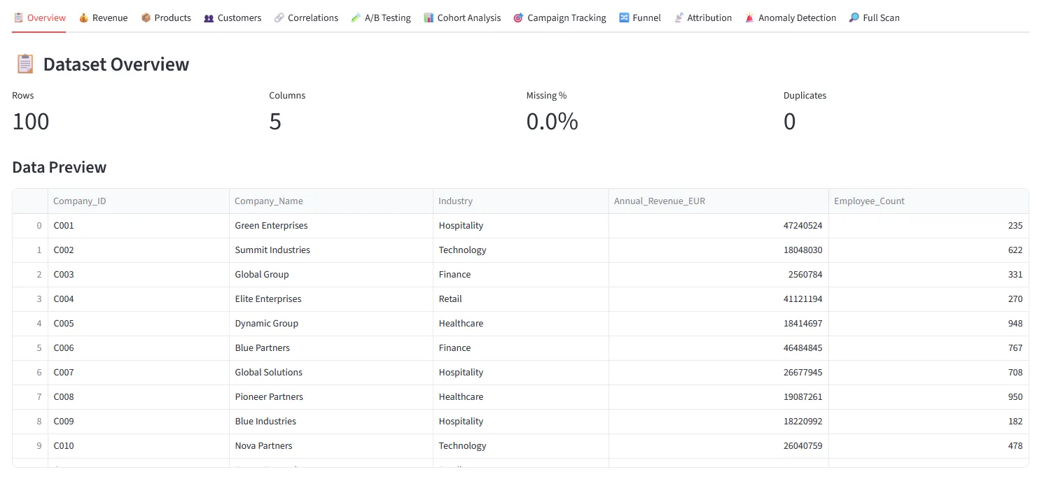
After uploading, the tool auto-detects which column is your date, revenue, customer ID and so on. You can correct it in two clicks if it guesses wrong — this is what unlocks the more specific analysis modules.
Drag and drop any file format — CSV, Excel, JSON, PDF, PowerPoint, Word. The tool reads it and shows a preview immediately.
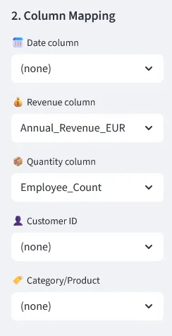
Auto-detected column mapping. Correct in two clicks if needed.
There is also a filter panel and direct CSV/Excel export — so if someone just needs to slice a dataset and hand it off, they can do that without opening Python or bothering their analyst. One bonus use case that turned out to be surprisingly popular: upload a business PowerPoint full of messy tables and embedded charts, get a clean, standardized Excel back. No copy-pasting required.
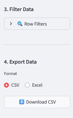
Row filters + CSV/Excel export. Upload a messy PPTX, download a structured spreadsheet.
The Architecture (A.K.A. The Part I Over-Engineered)
I structured the project as a set of clearly separated engines. That separation paid off massively when debugging — when something broke in the PDF extractor, I didn’t have to dig through visualization logic to fix it.
The four main components:
data_upload_engine/— handles everything from clean CSVs to messy PowerPoints with embedded chart images (yes, with OCR)analysis_engine/— all the statistical heavy lifting: RFM, cohorts, A/B tests, attribution, anomaly detectionviz_engine/— Plotly charts, heatmaps, time seriesai/— an optional local language model layer that runs 100% on your CPU, no internet, no API key
Local_analyst/
├── app/                  # Streamlit UI + tab routing
├── analysis_engine/      # All statistical logic
├── data_upload_engine/   # File readers (CSV, Excel, PDF, PPTX + OCR)
├── viz_engine/           # Charts and visualisations
├── ai/                   # Optional local LLM integration
├── models/               # Drop your .gguf model files here
└── download_model.py     # Downloads an AI model in one step
The AI Layer: Interpretation Without the Cloud
Since the Buzzword AI is a must these days, I naturally wanted to cover this as well. Once you have your analysis results, you can go one step further: hit “Get AI Interpretation” and get a plain-English explanation of what the numbers actually mean. No jargon, no follow-up meeting required. The tool offers three modes, switchable in the sidebar at any time:
- Rule-based (always available) — pre-written logic that spots patterns and surfaces them as readable findings. Zero dependencies, instant results. Always works.
- Local LLM — no server needed — a quantized language model (Qwen 2.5 · 1.5B) running entirely on your CPU via
llama-cpp-python. No GPU, no API key, no data leaving the machine. ~30s for the first response. - Ollama — server required — if you already run Ollama locally, point the tool at it and use any model you have installed.
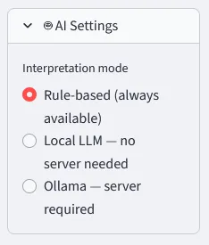
Switch interpretation mode in the sidebar — rule-based, local LLM, or Ollama.
Keeping the AI Grounded: Preventing Hallucinations and Inconsistent Answers
One of the trickier parts of working with local LLMs is that small models will happily invent numbers, contradict themselves between runs, or give you a completely different interpretation of the same chart depending on the day. Since the whole point of this tool is to help people trust their data, that was not acceptable.
A few things that made a real difference:
Temperature set low (0.1–0.2). Temperature controls how “creative” the model is. A high temperature makes responses more varied and unpredictable — great for writing poetry, terrible for interpreting a Spearman correlation. Setting it close to zero forces the model to be consistent and stick to the most probable, factual answer.
response = llm(
    prompt,
    max_tokens=512,
    temperature=0.1,     # low = deterministic, factual
    repeat_penalty=1.15  # discourages the model from looping or padding
)
The actual numbers go into the prompt. The model never sees just “analyze this chart.” It receives the computed statistics directly — the actual values, sample sizes, p-values — so it has nothing to hallucinate. It is asked to interpret numbers that already exist, not to generate them.
prompt = f"""You are a data analyst. Interpret the following results concisely.

Analysis type: {analysis_type}
Key findings: {json.dumps(results_summary)}

Provide a 3–5 sentence plain-English interpretation.
Do not invent numbers. Only refer to the values provided above."""
A strict system prompt. The model is told exactly what it is, what it should do, and what it is not allowed to do. No freeform storytelling, no invented context, no speculative conclusions. It is an interpreter of provided numbers, nothing more.
Rule-based output as a fallback and sanity check. The rule-based mode runs in parallel and produces structured findings independently of the LLM. If you are ever unsure whether the AI interpretation is reliable, you can switch modes and compare. The numbers do not change — only the narrative layer does.
None of this makes the AI perfect. Small models running on a CPU will still occasionally produce odd phrasings or overly cautious hedging. But for the use case — explaining what a correlation heatmap or an RFM segment means to a non-technical person — it is more than good enough, and it stays honest about what it knows.
Data Quality First
Most self-service tools will cheerfully visualize a five-row sample and let you draw conclusions from it. Pretty plots - yeah! My Local Analyst checks the dataset before running anything and flags problems with severity indicators. Four rows? Critical warning before any analysis runs. Bad input should never produce confident output.
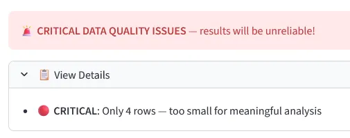
Hard stops for datasets too small or too broken to analyze reliably.
The Challenges — Where It Got Fun
Challenge #1: Reading Whatever File Someone Throws at You
Business data doesn’t arrive in clean CSVs. It arrives as a 47-tab Excel file, a PowerPoint with screenshots of charts, or a PDF export from some tool that generates tables as images. Building reliable ingestion for all of these — including OCR via easyocr for image-based tables — was easily the messiest part. Edge cases everywhere.
Challenge #2: Auto-detecting What Each Column Actually Means
The tool tries to figure out which column is “date,” which is “revenue,” which is “customer ID” — automatically. Sounds simple. It is not. People name columns in spectacularly creative ways. The column mapping logic went through about six iterations before it stopped confidently labeling customer_status as the revenue field.
Challenge #3: Running an LLM Locally on a Plain CPU
Getting llama-cpp-python to install reliably across Windows, Mac, and Linux without requiring a C++ compiler took some creative packaging. The result: one pip install, download the model with one Python script, and you have a working local LLM explaining your analysis results in plain English.
What Makes It Stand Out
- 🔒 The privacy angle — your data never leaves localhost. Not for analysis, not for the AI. This matters enormously in corporate environments where sending a customer CSV to some cloud service is a GDPR conversation waiting to happen.
- 📦 Zero cloud dependency — after the initial install, the tool works completely offline. Camp in the mountains, work on a flight, be in a GDPR audit — it doesn't care. It just runs.
- 🧠 Real statistics, not just charts — most "self-service analytics" tools give you bar charts. Local Analyst gives you RFM customer segments, statistical significance on your A/B tests, Pareto breakdowns. The Full Scan runs 11 analysis types at once and surfaces findings with severity ratings.
What I Learned
Modular from day one saves you later. The separation into engines meant I could rewrite the PDF reader without touching a single line of statistical analysis code. Adding a new analysis tab is mostly just adding a new module — the rest of the system doesn’t care.
The 80% use case is much harder than you think. Building something that works with clean test data takes a weekend. Building something that reliably handles whatever a real-world user uploads takes considerably longer. Most of the work was edge cases, not features.
Local AI is genuinely here. Running a 1.5B parameter language model on a laptop CPU and getting coherent, contextually relevant analysis summaries in under a minute is impressive. It’s not GPT-4, but it doesn’t need to be. For explaining a correlation heatmap in plain English? More than good enough.
Built with Claude Code. The entire project was developed using Claude Code as an AI coding partner — from architecture decisions to debugging edge cases in the PDF extractor. A fitting irony: a tool for making data accessible to non-technical people, built with the help of an AI assistant.
The project is fully open source, MIT licensed, and documented well enough for a non-developer to install (I hope). Takes about 10 minutes from zero to running your first analysis. All files stay on your machine, always.
If it saves even one person from forwarding their CSV to a cloud tool they don’t fully trust — or from emailing their data analyst at 4pm on a Friday — I’ll count it as a win. Thats a wrap for this post. Try it yourself and happy experimenting! :)
👉 github.com/MaikDulle/Local_analyst