Note: Use at your own risk. Be ethical about usage. Further, I am not a professional programmer/developer.
Use the Google Maps Scraper to build a small data set
You can use the Google Maps Scraper (https://github.com/omkarcloud/google-maps-scraper) to scrape data from Google Maps. It is limited to 120 entries per query but you can easily combine multiple queries and create a bigger dataset. Before installation make sure you have Google Chrome installed and download the matching Google Chrome Driver. Next clone Google Maps Scraper to your machine, install dependencies, configure the ‘main’ file to your needs. I had to manually put the Chrome Driver in the ‘build’ folder. Afterwards I could run it in my CMD without problems. For all of this I used Git CMD and VS Code on Win11.
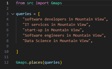
For this example we will scrape data about tech companies from Sillicon Valley (Mountain View, California). Lets see how many companies there are and how they are rated on Google Maps.
Here is my search query:
Data and analysis
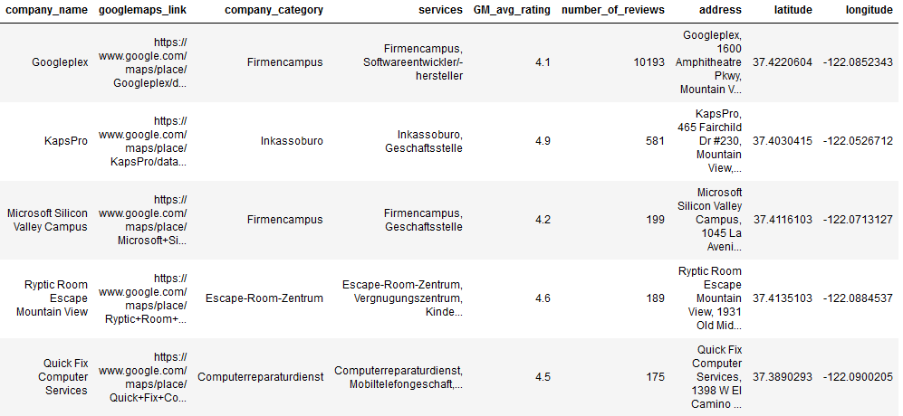
The scraped dataset contains 269 entries (before data cleaning) and the following varaibles:
- place_id
- name = Company name
- link = Google Maps link
- main_category = Company category
- categories = Services
- rating = Google avg. rating
- reviews = Number of reviews
- address
Note that category and services are in german due to my chrome settings. My goal is it to visualize the data by category, Google rating, amount of ratings, and create a heat maps with a Google maps layer. Looking at these variables, this tool is also a cool lead generator.
Requirements
import pandas as pd
import matplotlib.pyplot as plt
import numpy as np
import seaborn as sns
import scipy.stats as stats
from scipy.stats import spearmanr
import folium
from folium.plugins import HeatMap
from scipy.stats import zscore
Data preparation
After loading the data, firms that were scraped multiple times will be dropped and the decimal places of the review varialbe will be dropped, too. Our data set contains 193 entries after that.
GMD = pd.read_csv("Your/Path/Where/Data/Is/Stored.csv")
GMD = pd.DataFrame(GMD)
GMD
GMD = GMD.drop_duplicates(subset='name', keep='first') #remove dublicates firms
#GMD = GMD.reset_index(drop=True) # if you want to reset the index
GMD['reviews'] = GMD['reviews'].fillna(0).astype(int) #dealing with NaN in the reviews column
GMD
Next, we drop ‘place_id’ column that is not useful to us.
GMD = GMD.drop('place_id', axis=1)
GMD
Afterwards, we have to transform the google maps link into latitudes and longitudes in order to work with them later. We will create two new variables called ‘latitude’ and ‘longitude’ and add them to our dataset.
GMD[['latitude', 'longitude']] = GMD['link'].str.extract(r'!3d(-?\d+\.\d+)!4d(-?\d+\.\d+)')
GMD
Lastly, we rename the columns for better understandability.
column_mapping = {'name': 'company_name',
                  'link': 'googlemaps_link',
                  'main_category': 'company_category',
                  'categories': 'services',
                  'rating': 'GM_avg_rating',
                  'reviews': 'number_of_reviews'}

GMD.rename(columns=column_mapping, inplace=True)
GMD
For the whole dataset I used Juypiter Notebook. The preped dataset looks like this (category and services are in german due to my chrome settings):
Data viusalization
First, we will have a look at the company categories and their distribution. To do so we will just calculate how often differnt company categories occur in our dataset and visualize them via bar plot. We excluded company categories with less than 5 occurrences to make the visualization more clear.
# Calculate the summed occurrences for each category
count_company_cat = GMD['company_category'].value_counts()

# Combine categories with fewer than 5 occurrences into 'others'
threshold = 5
count_company_cat['others'] = count_company_cat[count_company_cat < threshold].sum()
count_company_cat = count_company_cat[count_company_cat >= threshold]

# Plot bar plot
comp_cat_bars = plt.bar(count_company_cat.index, count_company_cat)

# Display the absolute numbers on top of the bars
for bar in comp_cat_bars:
    plt.text(bar.get_x() + bar.get_width() / 2 - 0.1, bar.get_height() + 0.1,
             str(int(bar.get_height())), fontsize=9, color='black')

# Customize the plot
plt.xlabel('Company_catgeories')  # Replace 'Custom X-axis Label' with your desired label
plt.ylabel('Counts')
plt.title('Bar plot with summed categories')

# Rotate x-axis labels for better readability
plt.xticks(rotation=45, ha='right')

# Show the plot
plt.tight_layout()
plt.show()
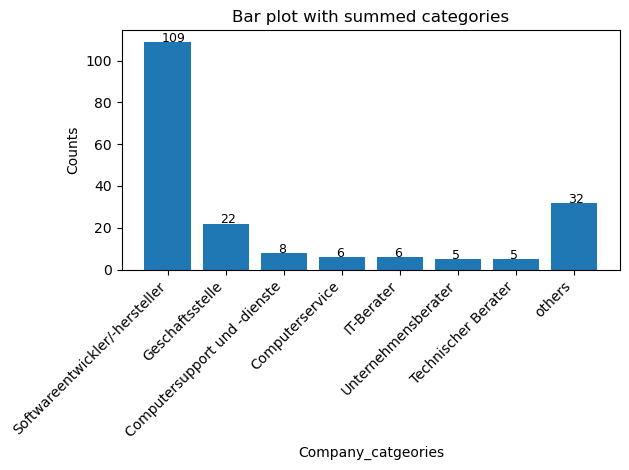
We can see that a majority of the companies in Sillicon Valley are categorized as software developers (n=109). Also 22 company HQs are located here according to Google maps.
Second, we will visualize the averraged Google ratings. To do so, we will calcualte the average rating by company rating and plot them. We will also include the distribution. We dropped companies with zero or only 1 rating.
# Drop categories with NaN values
GMD_rating = GMD.dropna(subset=['GM_avg_rating'])

# Filter out categories with only one observation
counts = GMD_rating['company_category'].value_counts()
GMD_rating = GMD_rating[GMD_rating['company_category'].isin(counts[counts > 1].index)]

# Calculate averaged values and standard deviations for each category
averaged_ratings = GMD_rating.groupby('company_category')['GM_avg_rating'].mean()
std_devs = GMD_rating.groupby('company_category')['GM_avg_rating'].std()
num_observations = GMD_rating['company_category'].value_counts()

# Plot line chart for averaged values
plt.plot(averaged_ratings.index, averaged_ratings, label='Averaged Ratings', marker='o')

# Draw error bands or error lines to show distribution (standard deviation)
plt.fill_between(averaged_ratings.index,
                 averaged_ratings - std_devs,
                 averaged_ratings + std_devs,
                 alpha=0.2, label='Distribution')

# Customize the plot
plt.xlabel('Company_categories')
plt.ylabel('Average rating')
plt.title('Line plot with distribution of averaged rating by company category')
plt.legend()

# Move the legend outside the plot and display number of observations
legend = plt.legend(loc='upper left', bbox_to_anchor=(1, 1))
legend.set_title("Legend")

# Add a text annotation for the number of observations
plt.annotate('Number of Observations:\n' + num_observations.to_string(),
             xy=(1.05, 0.5), xycoords='axes fraction', ha='left', va='center', fontsize=10, color='gray')

# Rotate x-axis labels for better readability
plt.xticks(rotation=45, ha='right')

# Show the plot
plt.grid(True)
plt.show()
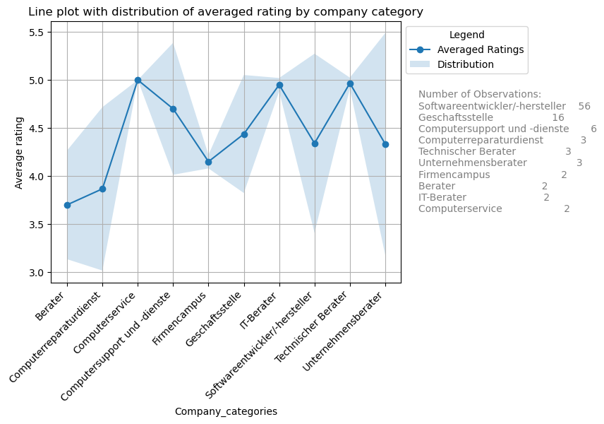
Computer services, IT and Tech consultants do have the highest average rating. Lowest rating are for consultants in general and for repair services. But note that the standard diviations are quite high. Interpret with caution!
Further, some summary statistics for the upper plot.
# Calculate summary statistics for the 'value' column
summary_stats_ratings = GMD_rating['GM_avg_rating'].describe()

# Display the summary statistics
print(summary_stats_ratings)
- count 95.000000
- mean 4.393684
- std 0.833706
- min 1.000000
- 25% 4.000000
- 50% 4.700000
- 75% 5.000000
- max 5.000000
We see that 95 companies where taking into account. The mean is 4.39, standard diviation is 0.83 and the median is 4.70.
We also plot the Cumulative Distribution Function (CDF) Plot cause its helpful to understand the proportion of observations below a certain value.
# Cumulative Distribution Function (CDF)
# Sort the average values in ascending order
sorted_values = np.sort(GMD['GM_avg_rating'])

# Calculate the cumulative distribution function (CDF)
cumulative_prob = np.arange(1, len(sorted_values) + 1) / len(sorted_values)

# Plot the CDF
plt.plot(sorted_values, cumulative_prob, marker='o', linestyle='-', color='b')
plt.xlabel('Average Values')
plt.ylabel('Cumulative Probability')
plt.title('Cumulative Distribution Function (CDF) for average rating')
plt.grid(True)
plt.show()
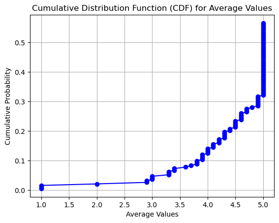
The plot shows us that only around 13% of ratings were 4 or less and nearly 70% gave a rating of 5.
Third, we will have a look at the number of ratings. We use the simple barplot for the job.
# Filter companies with more than 30 reviews
GMD_filtered = GMD[GMD['number_of_reviews'] > 30]

# Plot the values of 'number_of_reviews' for each company
plt.figure(figsize=(12, 6))

# Plot bar chart with no space between bars
sns.barplot(x='company_name', y='number_of_reviews', data=GMD_filtered, color='skyblue', edgecolor='black', linewidth=0.5)

# Annotate absolute numbers
for i, value in enumerate(GMD_filtered['number_of_reviews']):
    plt.text(i, value + 10, str(value), ha='center', va='bottom')

plt.xlabel('Company Name')
plt.ylabel('Number of Reviews')
plt.title('Number of Reviews for Each Company (Companies with >100 Reviews)')
plt.xticks(rotation=45)
plt.tight_layout()  # Adjust layout for better visualization
plt.show()
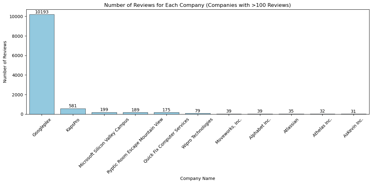
We see that GooglePlex has a lot more reviews than the other companies. Googleplex having around 10k reviews followed by KaspPro with 581 reviews. Googleplex is clearly an outlier in this category.
Correlation analysis
As a plus we will also check if the Google rating is correlated to the number of reviews. But before we do, we check for normality via QQ plot.
# Q-Q plot to check normality
plt.figure(figsize=(12, 5))

plt.subplot(1, 2, 1)
stats.probplot(GMD['number_of_reviews'], dist="norm", plot=plt)
plt.title('Q-Q Plot: Number of Reviews')

plt.subplot(1, 2, 2)
stats.probplot(GMD['GM_avg_rating'], dist="norm", plot=plt)
plt.title('Q-Q Plot: Company Rating')

plt.tight_layout()
plt.show()
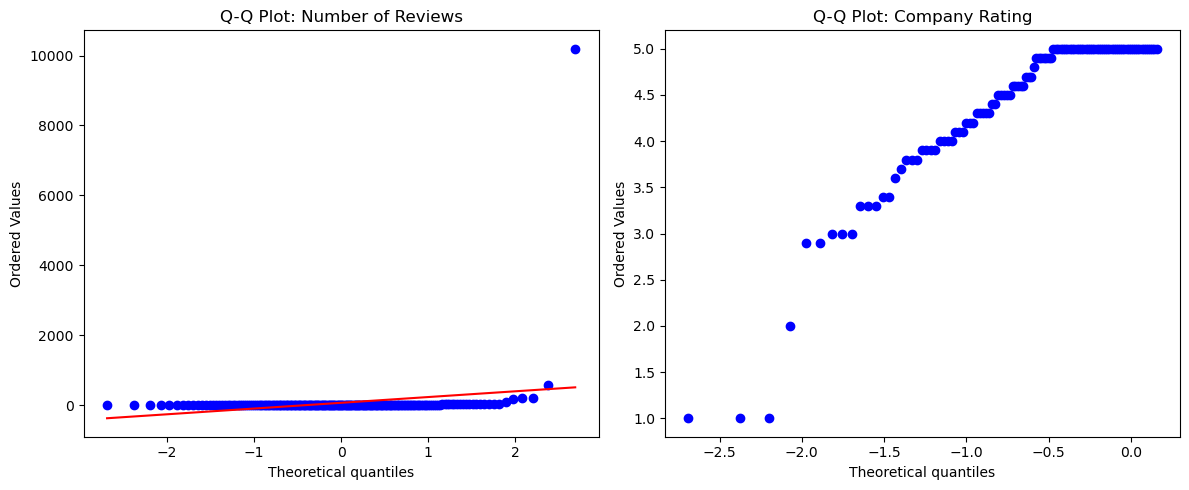
We see in the plots that the normality assumption is violated. We will therefore take a non-parametric test (spearman) of correlation.
Next, lets check the correlation. We remember form our visualization of the number of reviews that we have a large outlier for the Googleplex. We will remove this outlier using the IQR method (https://en.wikipedia.org/wiki/Interquartile_range).
# Define a function to remove outliers based on IQR
def remove_outliers(df, column, threshold=1.5):
    Q1 = df[column].quantile(0.25)
    Q3 = df[column].quantile(0.75)
    IQR = Q3 - Q1
    lower_bound = Q1 - threshold * IQR
    upper_bound = Q3 + threshold * IQR
    return df[(df[column] >= lower_bound) & (df[column] <= upper_bound)]

# Remove outliers from 'number_of_reviews'
GMD_no_outliers = remove_outliers(GMD, 'number_of_reviews')

# Plot the scatter plot to visualize the relationship
plt.figure(figsize=(10, 6))
sns.scatterplot(x='number_of_reviews', y='GM_avg_rating', data=GMD_no_outliers)
plt.xlabel('Number of Reviews')
plt.ylabel('Company Rating')
plt.title('Scatter Plot: Number of Reviews vs. Company Rating (with Duplicates)')
plt.show()

# Calculate Spearman rank correlation coefficient and p-value
correlation_coefficient, p_value = spearmanr(GMD_no_outliers['number_of_reviews'], GMD_no_outliers['GM_avg_rating'],nan_policy='omit')

print(f"Spearman Rank Correlation Coefficient: {correlation_coefficient}")
print(f"P-value: {p_value}")
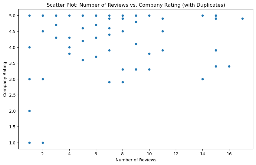
The scatterplot shows a negtive correlation. The more reviews the lower the rating. But be aware. This could be a classical example of sample size sensitivity of the test. It is likely that companies with only 1 or 2 ratings have a higher average than companies with 500.
- Spearman Rank Correlation Coefficient: -0.3084
- P-value: 0.0028
Heatmapping
We will use the folium library for building our heatmap. It is totally open-source and quite easy to use. So lets go!
# Convert latitude and longitude columns to numeric
GMD['latitude'] = pd.to_numeric(GMD['latitude'], errors='coerce')
GMD['longitude'] = pd.to_numeric(GMD['longitude'], errors='coerce')


# Calculate Z-scores for latitude and longitude columns
z_scores = zscore(GMD[['latitude', 'longitude']])

# Define a threshold for Z-scores (e.g., 2 standard deviations)
threshold = 2

# Filter out rows with Z-scores beyond the threshold
GMD_filtered = GMD[(abs(z_scores) < threshold).all(axis=1)]

# Create a base map centered at an initial location
m = folium.Map(location=[37.386051, -122.083855], zoom_start=12) # Experiment a little with zoom

# Combine latitude and longitude data into a list of coordinate pairs
coordinates = list(zip(GMD_filtered['latitude'], GMD_filtered['longitude']))

# Add heatmap layer to the map
HeatMap(coordinates).add_to(m)

# Save the map as an HTML file or display it
m.save("heatmap_without_outliers.html")
We checked for outlier in our coordnitates by using the z-score. If you work with scraped data (especially with huge amounts) you never know about outliers. Therefore, as a measures of keeping data quality high, I always check for outliers. Next, we use our coordinates to mark them on an interactive heatmap layer and save it as an HTML document.
# Convert latitude and longitude columns to numeric
GMD['latitude'] = pd.to_numeric(GMD['latitude'], errors='coerce')
GMD['longitude'] = pd.to_numeric(GMD['longitude'], errors='coerce')


# Calculate Z-scores for latitude and longitude columns
z_scores = zscore(GMD[['latitude', 'longitude']])

# Define a threshold for Z-scores (e.g., 2 standard deviations)
threshold = 2

# Filter out rows with Z-scores beyond the threshold
GMD_filtered = GMD[(abs(z_scores) < threshold).all(axis=1)]

# Create a base map centered at an initial location
m = folium.Map(location=[37.386051, -122.083855], zoom_start=12) # Experiment a little with zoom

# Combine latitude and longitude data into a list of coordinate pairs
coordinates = list(zip(GMD_filtered['latitude'], GMD_filtered['longitude']))

# Add heatmap layer to the map
HeatMap(coordinates).add_to(m)

# Save the map as an HTML file or display it
m.save("heatmap_without_outliers.html")
And here is the result:
We can see that around the city center and the airport there is the highest density of tech companies. In case you want to build your own tech empire, you would be well advised to settle somewhere there (if affordable).
Thats a wrap for this post. Try it yourself and happy experimenting! :)